


Bold Map of a World at War
How an innovative polar projection translated the round earth onto flat paper

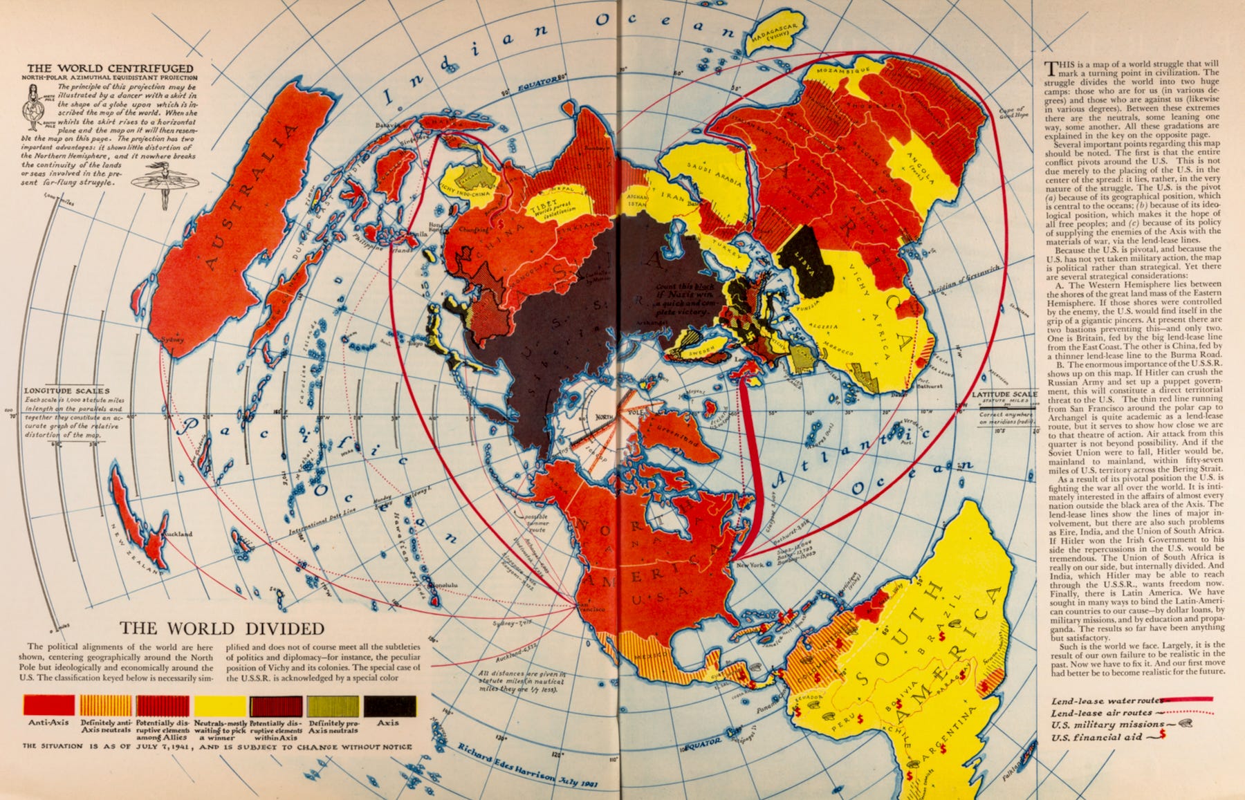
A striking map by Richard Edes Harrison, published in Fortune Magazine for August 1941. Harrison used a then-unusual polar projection of "a world struggle that will mark a turning point in civilization," one that "divides the world into two huge camps."
The United States had not entered the war, but Harrison designed the map to illustrate his point that "the entire conflict pivots around the U.S." because of its geographical position, its ideology of freedom, and its lend-lease support of the soon-to-be Allies.
Harrison was trained in architecture and design rather than as a cartographer, and that background enabled him to break from convention. His techniques defied convention and created a new standard for the look and shape of the world on a map.
Harrison came to maps by chance. Trained in design, he arrived in New York during the Depression and made a living by creating everything from whiskey bottles to ashtrays.
One day, a friend at Time asked him to fill in for an absent mapmaker at its sister publication, Fortune.
That unexpected call led to a lasting collaboration, one where Harrison used techniques of perspective and color to translate the round earth onto flat paper.
In fact, Harrison considered his lack of training in cartography an advantage, for he had no fixed understandings of what a map should look like. ~ The New Republic
In the upper left corner of the map, Harrison uses the analogy of centrifugal force lifting the skirt of a spinning dancer to explain the projection he used here.

The visual power of this map in conveying the threat depends to a great degree on the size and menace of the black area of the Axis powers opposing the U.S. across the Pole. But Harrison needed more than a bit of artistic license to convey the point.
The map was published in August 1941, and the legend on the lower left explains that "the situation is as of July 7, 1941."
It's likely that Harrison prepared this map in June 1941, at a time when the Soviet Union was aligned with Germany under the Molotov-Ribbentrop Pact. But on June 22, 1941, Germany invaded the Soviet Union.
Harrison solved this artistic problem by coloring the USSR a very dark brown - almost indistinguishable from the Nazi black - and adding a legend on the map: "Count this black if Nazis win a quick and complete victory."
In the text, he wrote, " If Hitler can crush the Russian Army and set up a puppet government, this will constitute a direct territorial threat to the U.S." Happily, that was not to be the case.
Title: The World Divided
Creator: Richard Edes Harrison
Date: 1941
Source: Fortune Magazine.
Date: August 1941. 48-49.
Repository Persuasive Maps: PJ Mode Collection
For a very different map by Harrison, see: An Aerial View of New York City (1931)
Fascinating! It’s interesting that Harrison was an expert in design and not cartography, and this allowed him a new perspective. So many interesting things happen when we cross-train or work with interdisciplinary teams. But I think this only works if someone has taken the time to become excellent at something once already.
Even with my glasses I can't see the map clearly. Is that black dot Mar a Lago?